St Giles' Cathedral Visual Identity
Brand Identity, Art direction & Graphic Design
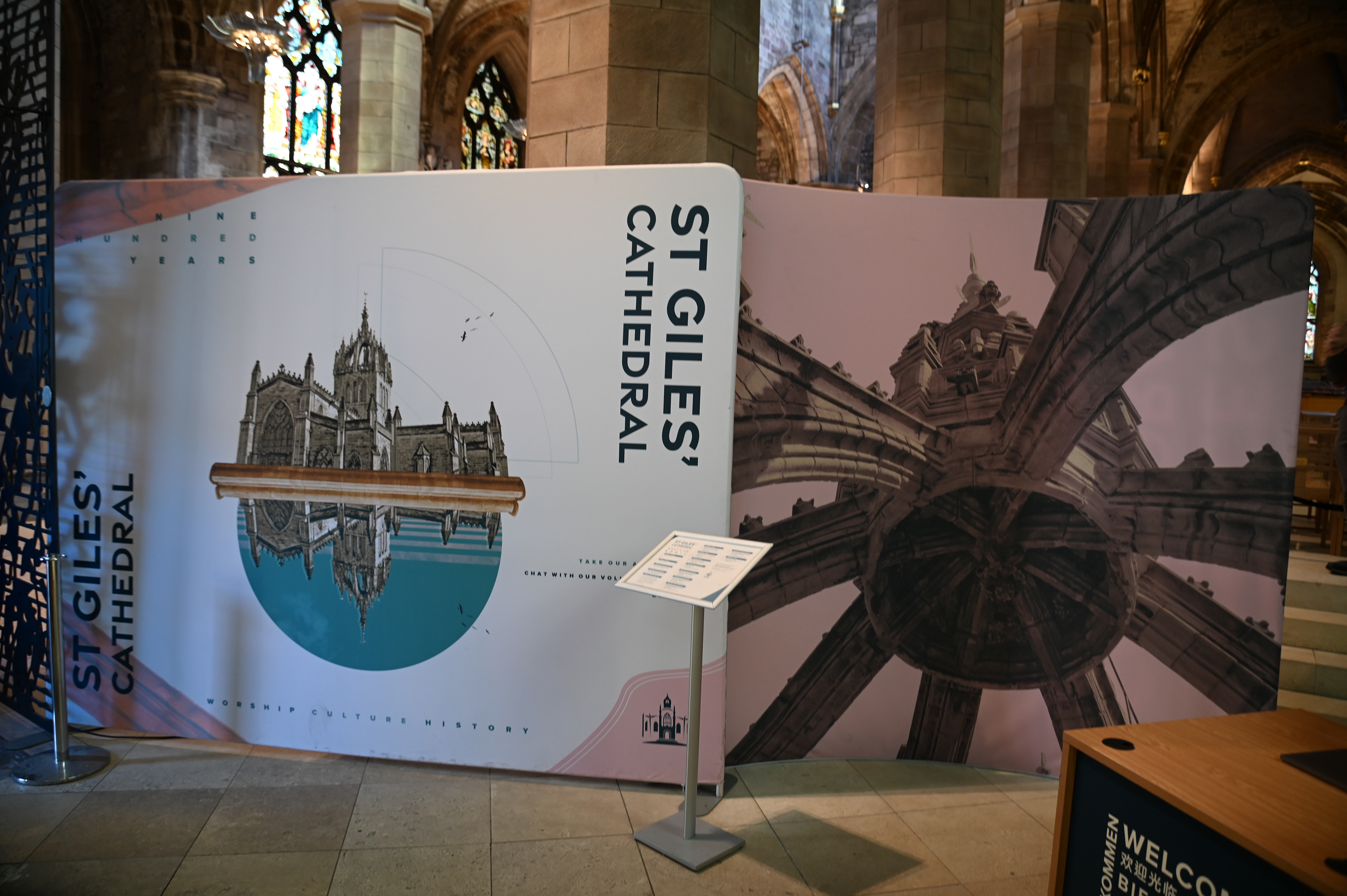
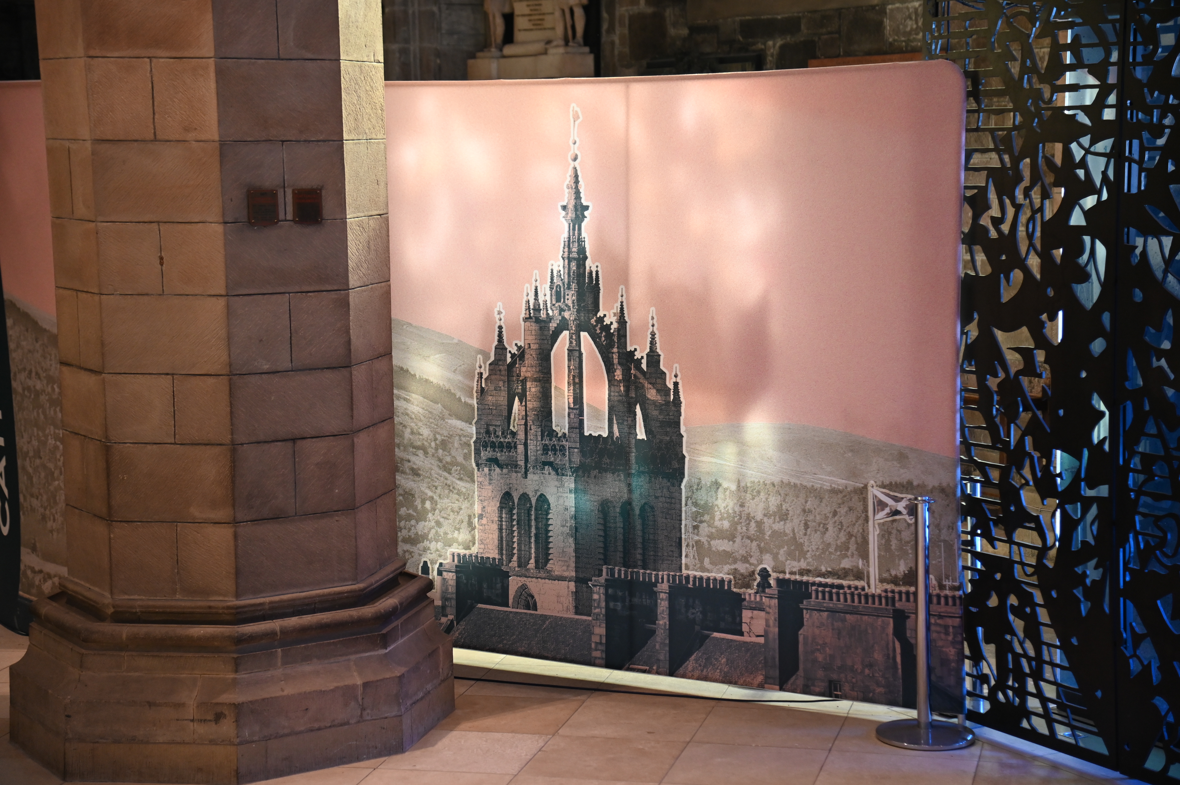
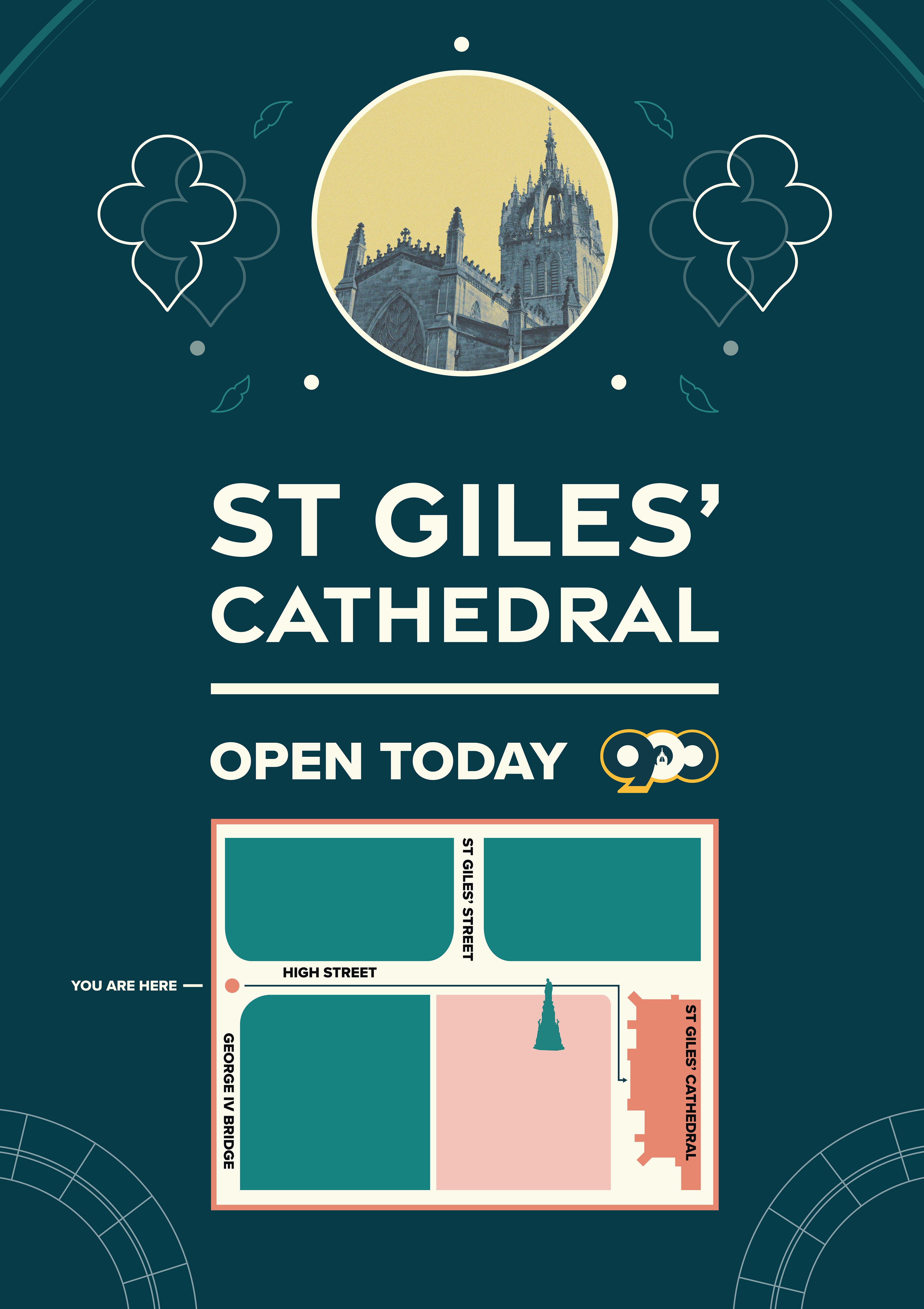
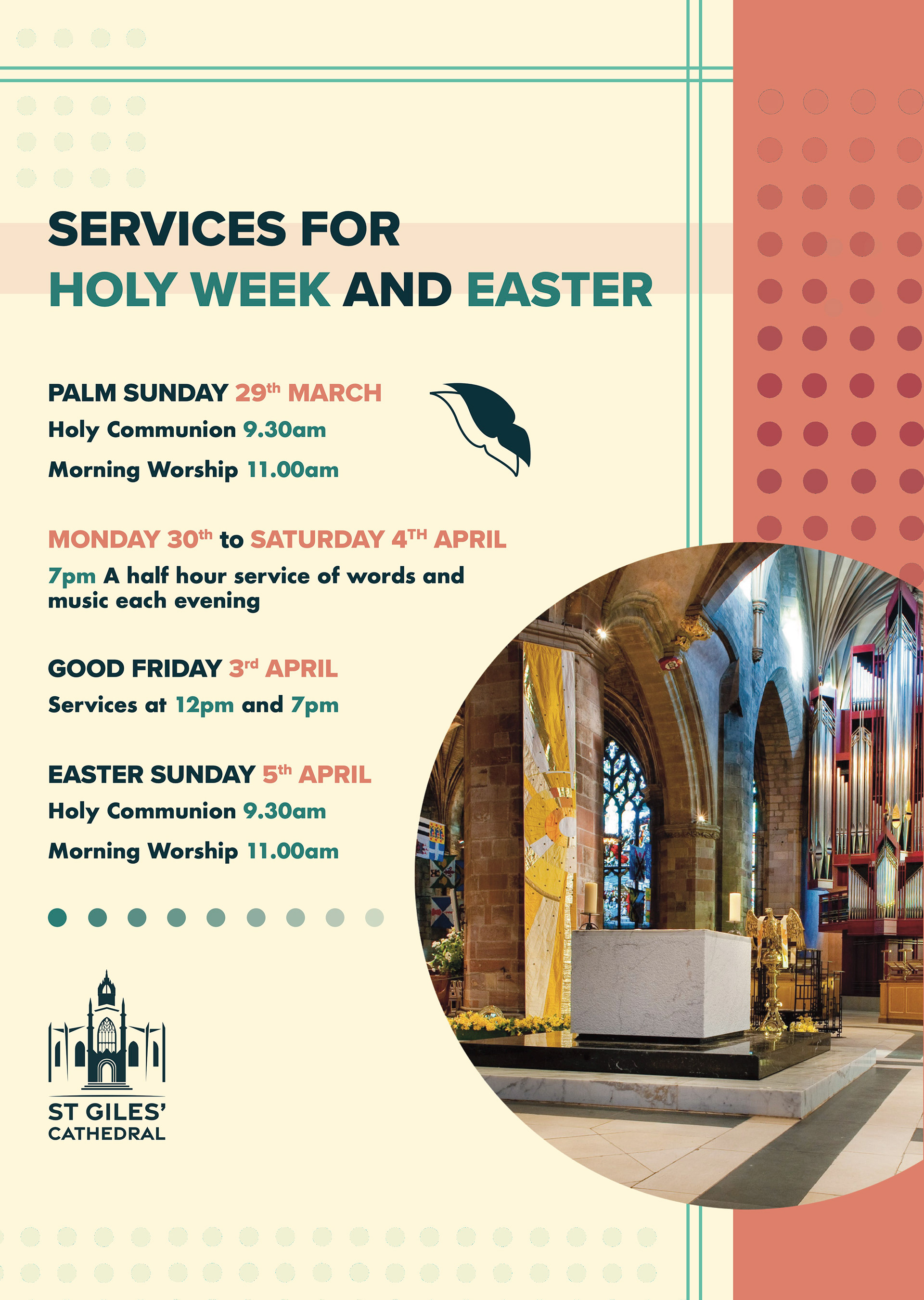
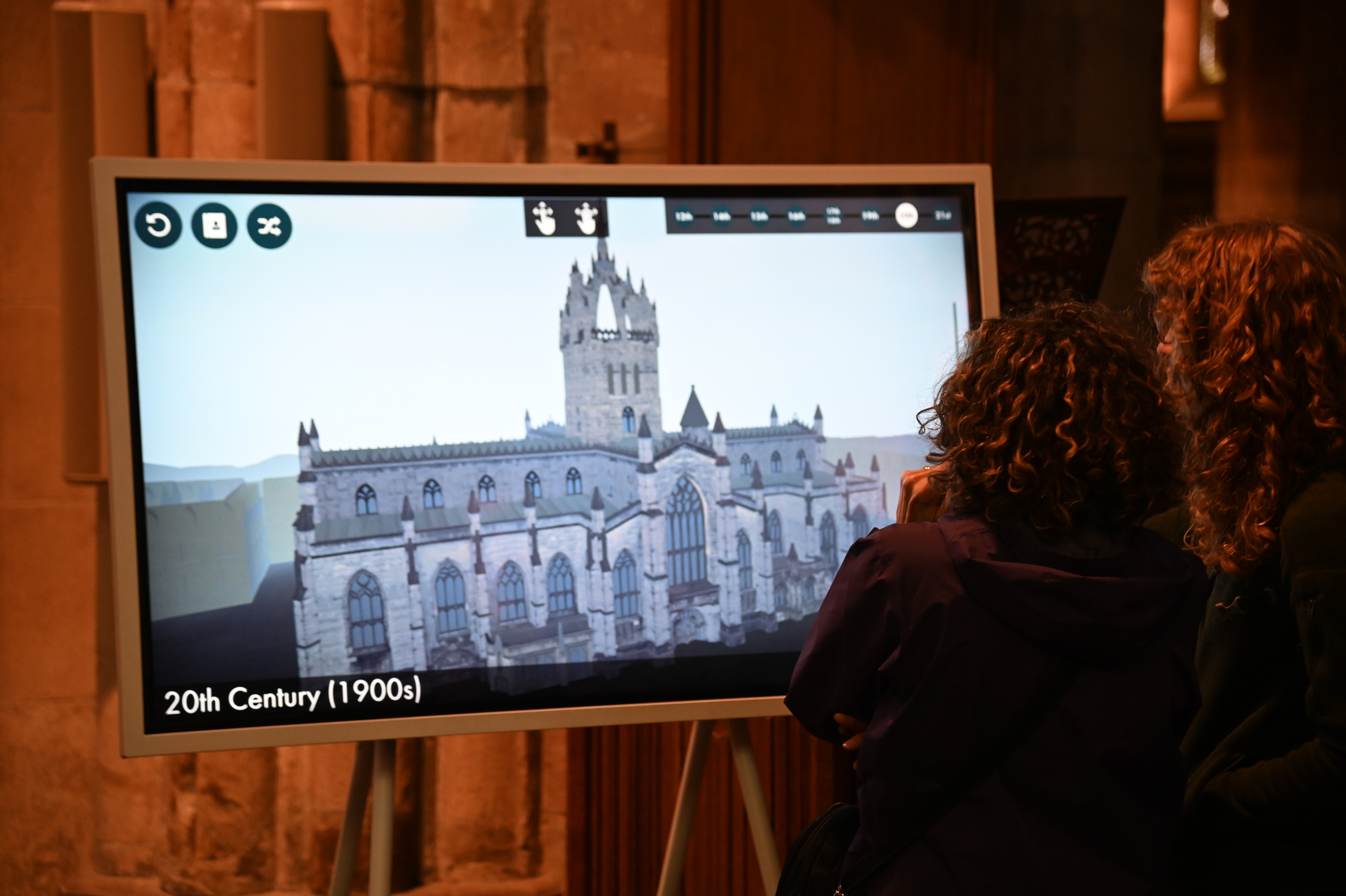
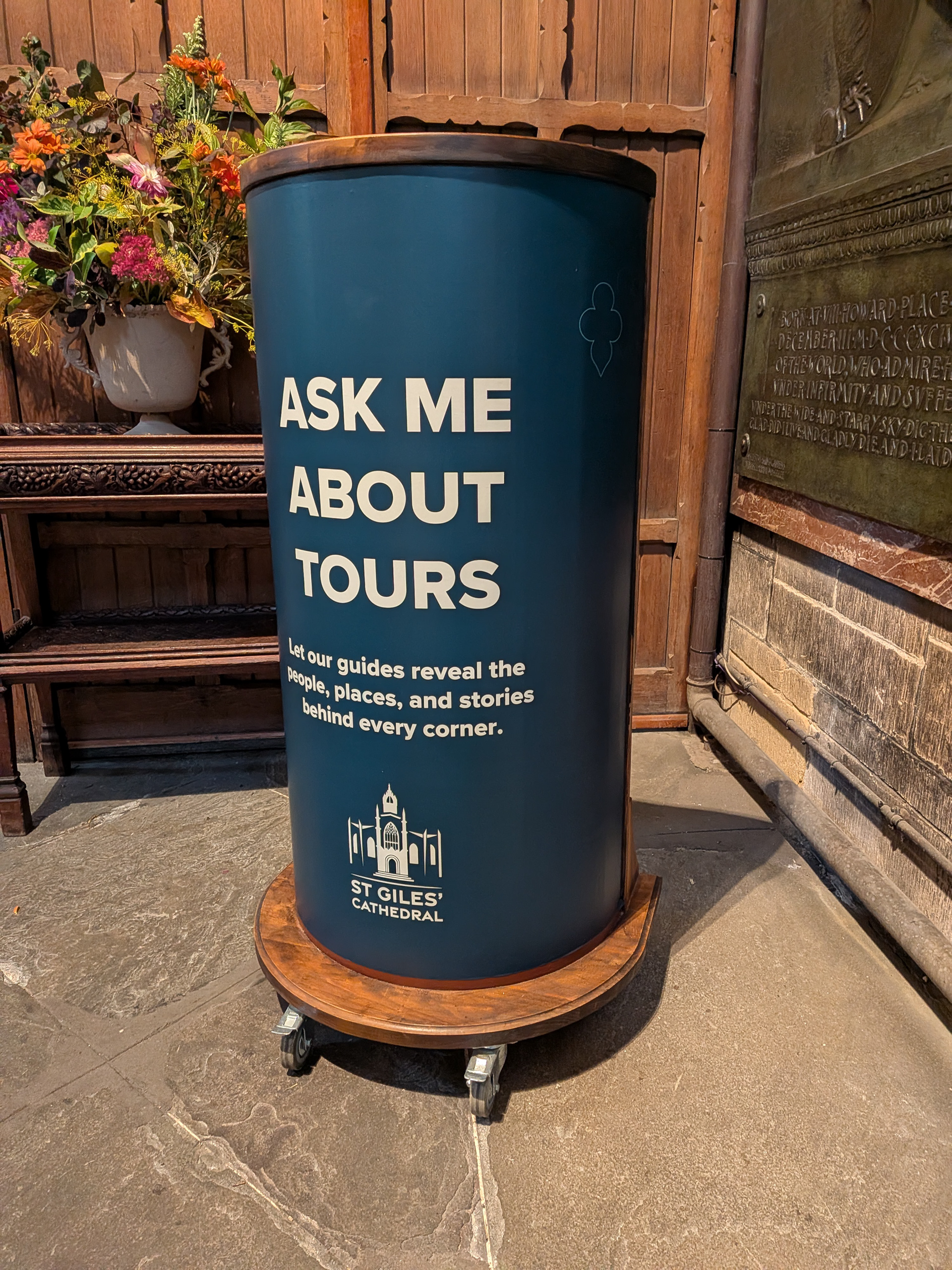
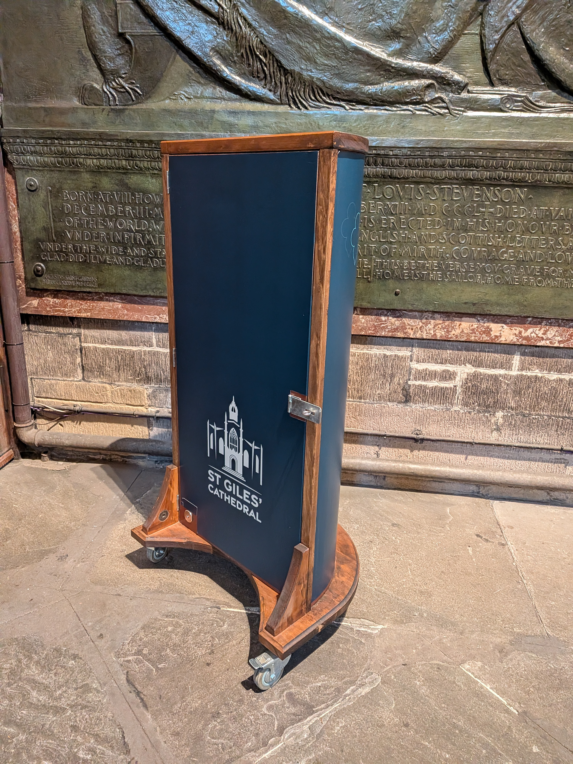
During my four years as Designer at St Giles’ Cathedral, I developed a new visual identity designed to feel cohesive, welcoming and contemporary, whilst remaining rooted in the cathedral’s historic character. This included a refreshed logo suite, typography, colour, imagery, and graphic elements to create a flexible identity that could work across both visitor-facing and organisational materials.
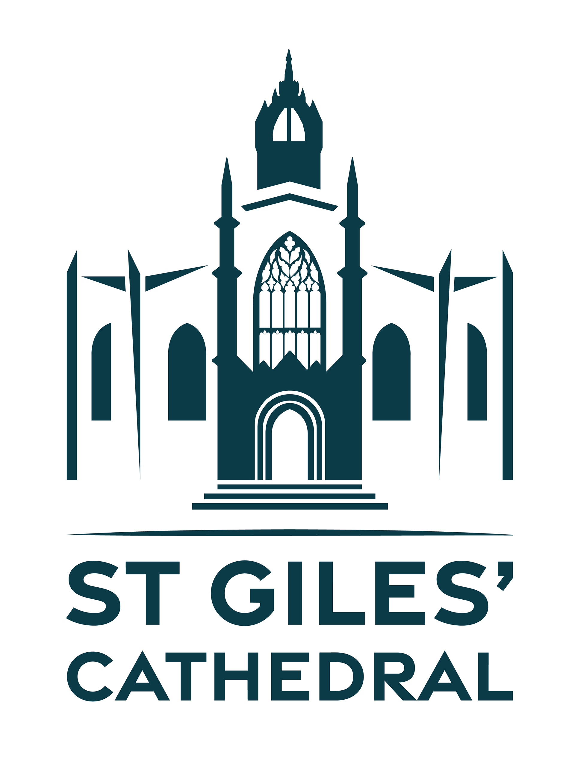


The primary logo draws on the cathedral’s distinctive architecture, simplifying recognisable features into a contemporary mark. The secondary logo offers a more flexible alternative, combining details from the Burns window, crown and architectural ribs whilst a text-only version provides a simpler logo for applications where the full logos aren't suitable.

The identity pairs bold, accessible typography with a broad colour palette and a flexible set of logo variations, designed to work across a wide range of print and digital applications. This condensed guideline sheet brings those core elements together at a glance, showing how the branding could remain consistent whilst adapting to different formats and uses.
BRAND IN APPLICATION